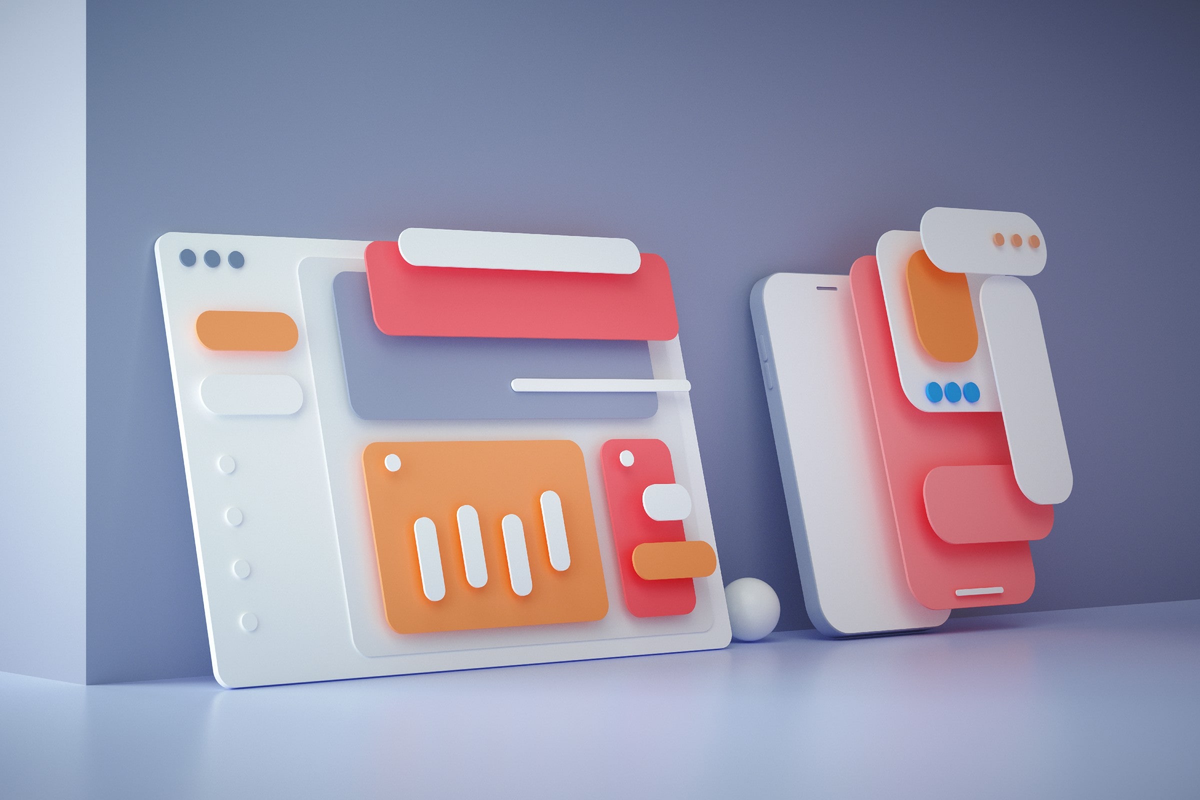
Design layouts are undoubtedly crucial for any graphic design, especially since graphic designers can see how individual elements will look together on a single page before the design goes public.
With these, they can arrange everything accordingly and ensure that the results convey precisely what they want their audiences to perceive. However, there are a few things you need to know about creating design layouts.
With that said, here are the top 5 rules of design layouts that designers need to know. These will serve as valuable layout tips that can help you create fantastic layouts for your designs.

What Is a Design Layout?
So, what is a design layout? Simply put, a design layout is how graphic designers lay everything on a page. In this case, it refers to how designers arrange every element that eventually makes the design content.
Design layouts help ensure that the message will be conveyed correctly, logically, and cohesively. Furthermore, design layouts help emphasize the most critical element of a page.
For example, let’s consider a design layout as a meal. In this case, the design elements, such as the lines, colors, and shapes, are the meal’s ingredients.
So, to create a meal, you have to mix all the ingredients. However, you don’t just mix everything as you please since there are recipes that you have to follow. With that said, these recipes are similar to design principles, such as movement, proportion, contrast, etc.
These will help you create better layouts, just like how recipes guide chefs in cooking better meals. Then, the final product of both elements and principles of design is the design layout.
The 5 Rules in Design Layout
So, what are the top five rules for design layouts? Check them out below.
1. Use Grids
The use of grids, especially in web design, has been thoroughly integrated into the industry since they can help make your design cleaner, more efficient, and easier to adapt. Moreover, grids help the graphic designer organize the design throughout the page.
Furthermore, gridlines can also work as a roadmap, especially in a team, since the designers will know which place and grids to design. Aside from these, they also provide a higher level of consistency and require less time to adjust and update designs because they’re easier to follow.
2. Scale and Emphasis
Another rule in layout design is that designers should always practice scale and emphasis in their designs. This means having something that can immediately grab the audience’s attention so they won’t quickly move on from the page.
For example, in a photo of a butterfly, you can use these two elements to communicate to your audience which one’s the focal point. In this case, it would be the butterfly, not the flowers or surrounding scenery.
By applying these two concepts, you can guide your audience’s attention to where you want them to look and avoid distracting them with the other elements in your design.
3. Rule of Thirds
The rule of thirds is another simple yet effective principle in design. This principle states that designers should divide their design into three rows and three columns. In fact, you can observe this principle in various types of designs, including both 2D and 3D designs.
In this case, this principle states that the intersection of the vertical and horizontal lines is where you should put your subject and other design elements. This will help give balance to your design layout.
4. Balance
Another rule of design layouts is that they should have balance to ensure harmony among all the elements present in the design. For example, designers have to mix and match several elements to convey a powerful message.
However, they also have to ensure that elements aren’t clustered on just one side of the grid, which throws off the balance of their design.
Moreover, you have to keep in mind that your layout’s white space is also essential for your design. Your white space gives people a specific path that guides them on where to look to follow the design. This gives their eyes some breathing space.
Also, suppose you keep on adding complicated and unnecessary elements to your design. In that case, your audience may end up feeling overwhelmed, or worse; they may not be able to interpret the page visually. Because of this, having some white space won’t hurt your design.
5. The Odds Rule
Apart from the layout tips mentioned above, this rule states that having an odd number of elements in the foreground pleases the viewers’ eye. In this case, the typical number of elements used would be three.
This is because the two objects on either side can help balance the design’s focal point, which usually serves as the central point of your layout. In general, you can usually see these rules of odds in logo designing.
Conclusion
Now that you already know the five critical rules in design layout, it is time for you to incorporate them into your design to achieve an effective graphic design layout.
The rules mentioned above can serve as helpful illustration tips as well that can help you create more aesthetically pleasing designs that are also clean and structured. In this case, you can do all of these without compromising the emphasis of your subject.


