
The majority of popular websites today stand out with their eye-popping color schemes, sharp images, and informative content.
However, suppose you piece these ingredients altogether without any proper hierarchy. In that case, you will suddenly come to realize the importance of having a well-organized layout in any given website.
With that said, this article lists some website layout recommendations, layout tips for site design, and best practices.
What Is a Website Layout?
Simply put, a website layout refers to a pattern comprising the specific arrangement of all visual components, such as images and text-based content. Website layouts can help visitors navigate through several pages seamlessly, given that the vital elements are at the front and center.
Keep in mind, though, that a one-size-fits-all layout for any website does not exist at all. Therefore, it’s vital, in this case, to first determine the type of product, service, or content your website provides so that you can easily choose the most suitable layout for that site.
Best Website Layouts to Try
- Featured Image
A featured image layout works best on freelancer or professional-owned websites and niche blogs. In this layout, a professional’s representative image appears in the background of each page, which then highlights a summary of that individual’s career history and field expertise.
Moreover, the featured image layout is one of the most frequently used website formats today.
- Thumbnail Gallery

If you are currently running a website dedicated to travel, you should check out the thumbnail gallery layout. Not only it consists of an album-like collection of tiny images, but it also contains a headline serving as a guide within the gallery.
For this, upon clicking on an image or a nearby link, the website redirects the user to a comprehensive description related to that image. This visual arrangement works wonders for visually inclined visitors.
- Asymmetrical

The asymmetrical website layout, meanwhile, is a rarely used format. While it bends the rules of symmetry, this arrangement also surprisingly offers designers a unique and satisfying result.
Blending the asymmetrical form into your website might sound complicated or tricky. However, by creating a few active spaces on your pages and making white areas more vibrant, you can still pull it off.
Nevertheless, this format is perfect for individuals who showcase unusual portfolio presentations and businesses that offer web design.
- Zig-Zag
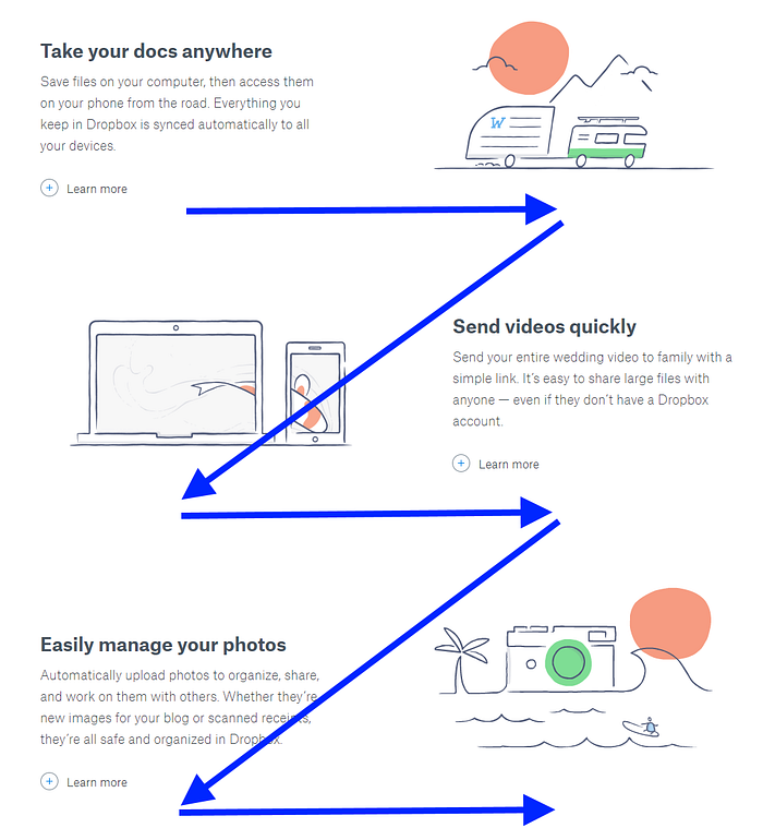
Most website visitors read content through only a few known optical scanning behaviors, one of which includes a zig-zag pattern. In most cases, the users’ eyes go from left to right, down, and back to the left.
Thus, a few pioneers decided to create the zig-zag website layout for maintaining user engagement. This aptly named content formation applies to a broad range of websites in several industries.
- F-Shaped

The F-shaped reading habit is the other mentioned user scanning behavior, wherein the eyes move across a web page in such a pattern.
As a result, an F-shaped website layout was formed and adapted for wide use in most e-commerce businesses. Overall, the F-shaped layout is best suited as well for use in portfolio websites.
- One-Column

The unmatched benefit of using the one-column layout on your website is its simplicity. Perhaps the least complicated format to use, this layout simply lets you arrange text, images, and videos in a single, user-friendly vertical formation.
In this case, the only aspect that you need to work on is to emphasize possible points of interest. The one-column layout is compatible with long-form articles and online research papers. Furthermore, it is best suited for browsing on mobile devices.
- Grid
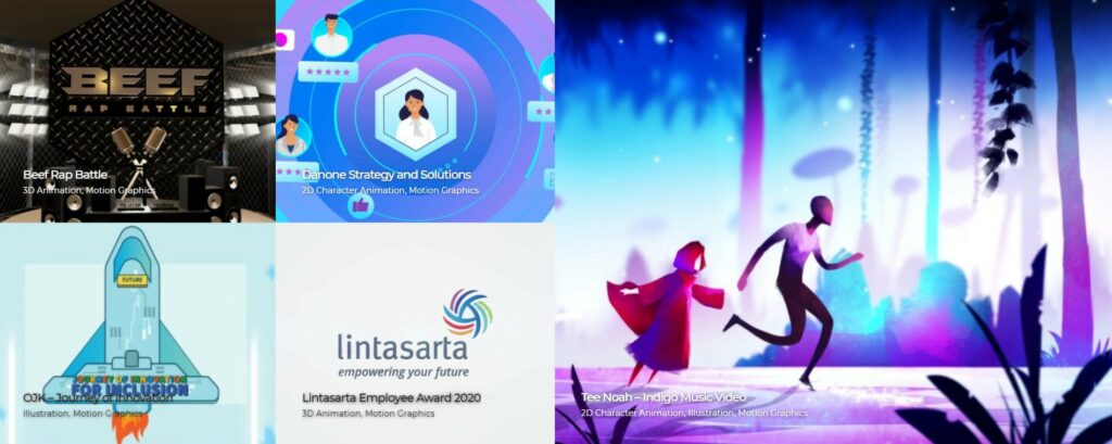
Most successful websites use a grid arrangement for an easy browsing experience. If you want your online venture to succeed as well, think of integrating the grid website layout into your overall design plan.
The advantage of using this pattern is possibly the equally distributed text, images, and videos on a single web page. It also allows visitors to check on the significance of each section one at a time. Therefore, using the grid layout is a must for web-based newspapers and vlogs.
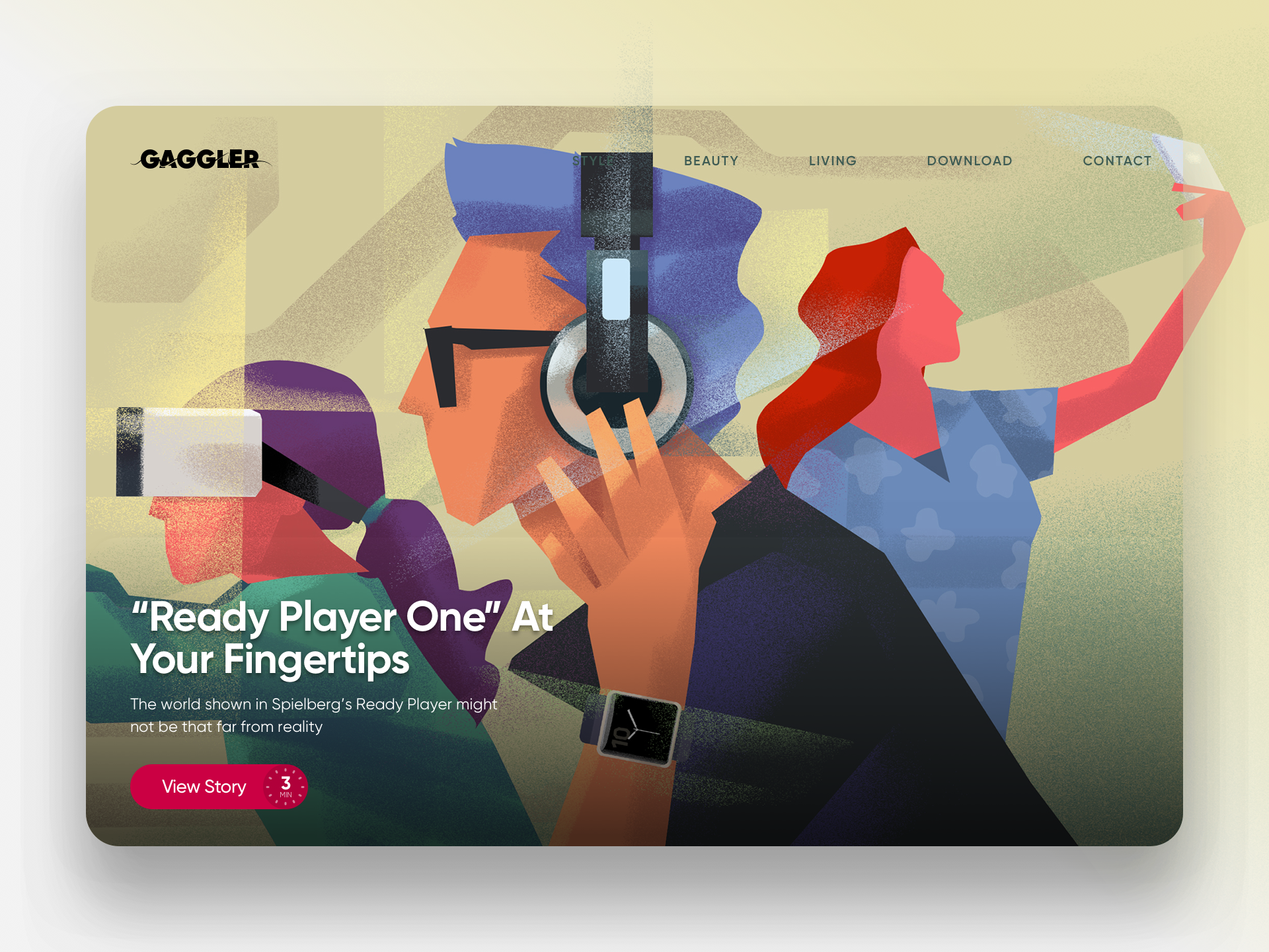
- Fullscreen Photo

The fullscreen photo website layout has become increasingly popular these days. It comprises an encompassing background image containing spread-up content.
To add to the liveliness of the fullscreen image using this layout, you should indicate the menu portions and add a few text sections.
Companies that use the fullscreen photo layout on their websites are mostly over-the-top content platforms offering video-on-demand and streaming media.
- Single-Page

The final entry on the list – the single-page website layout – may not be among the most typically used formats. However, sites that feature the single-page formation generate unique web addresses (URLs) and load content dynamically.
Perhaps the best part of navigating through a single-page website is the almost seamless transition between different pages. However, a few designers use this layout because it integrates multiple actions into a single page. You can see an example of this functionality in most email service providers.
Bonus: Tips and Best Practices
- Split the various elements cleverly into readable sections on a web page.
- Add focal points to specific features on your product or service.
- Use a balanced mix of visual weight and negative space on grid layouts.
Conclusion
With that said, aside from these layout tips, it’s best to reflect first on your business’ product or service offering and the core message to your target audience before deciding on a final website layout.
Then, once you have established your online identity, you can settle on the most suitable format for your site.