Back in the day, web designs revolved around animations and flashy pictures. This is why most web graphic designers focused on making the visitors and viewers of various websites amazed by the designs. Flat illustration has become a widely used style in modern design because of its simplicity, clarity, and visual appeal. Then, skeuomorphic design became popular, aiming to mimic incredible pictures in life using drop shadows, actual object characteristics, realistic textures, motion graphics, 2d and 3d designs.

Another progress in web designing is flat design, which contradicts all the artificial design methods and focuses more on classical and simplified digital aesthetics. It is often seen in simplified logos, icons, and layouts.
So, it helps to deliver understandable and businesslike notes to users through its simple curves and shapes. This style has been out for years now and remains popular and relevant as ever.
All About Flat Design
The flat design creates a significant impact on modern illustrations, especially when creating remarkable visuals. It’s defined as a straightforward and minimalistic design in graphics with minimum and simple effects, details, and smooth forms.
Nowadays, these designs are seen almost everywhere, like smartphone applications, websites, advertising, and branding. Moreover, its most leading feature is trying flat 2d visuals in contrast to realistic and skeuomorphic visuals.
For more than two years, this design has been progressing, and its style is considered favorable for visual harmony and strengthens usability.
Of course, flat design has its roots. The design was inspired in Swiss style, which was criticized in the 1920s and got its brilliant expression in Switzerland’s graphic design in the 1940s-50s and became popular in graphic design in the 20th century.
At present, many designers and enthusiasts are applying flat illustrations to discover their skills.
Creating Catchy Flat Illustrations
For beginners who want to express their creativity in flat images, there are explainer videos and layout tips available to hone your skills. However, flat design can be more challenging than other styles as it is limited in volume and expression.
It is not impossible to unlock this skill; they say practice makes perfect. To learn more, here are some illustration tips in flat design.
1. Learn to analyze the artworks of others
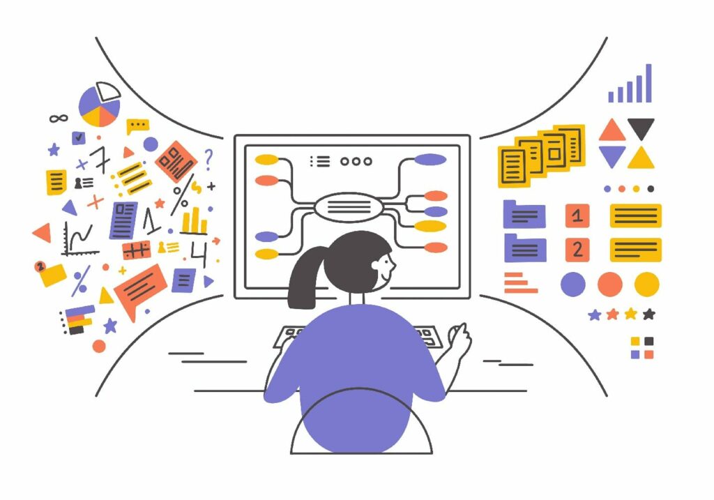
Researching and trying to understand the artworks of other illustrators is crucial. This can be done by analyzing the approaches and principles they use and endeavoring to consider and practice the color solutions and elements they apply in their artwork that you find attractive. Mastering flat illustration requires understanding composition, angles, and color harmony.
2. Select exciting composition and perspective
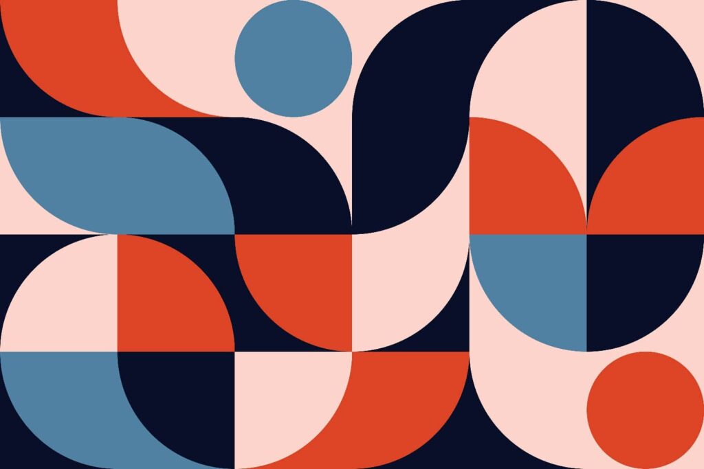
If you want to express calmness in your artwork, ensure to find a balanced composition. However, if you choose to have a multidimensional composition, you should have a clear plan like adding an accent where most elements and characteristics are applied. Aside from this, you can also apply rhythm to your artwork with details, tone accents, and color scaling.
3. Do not apply easy geometrical concepts
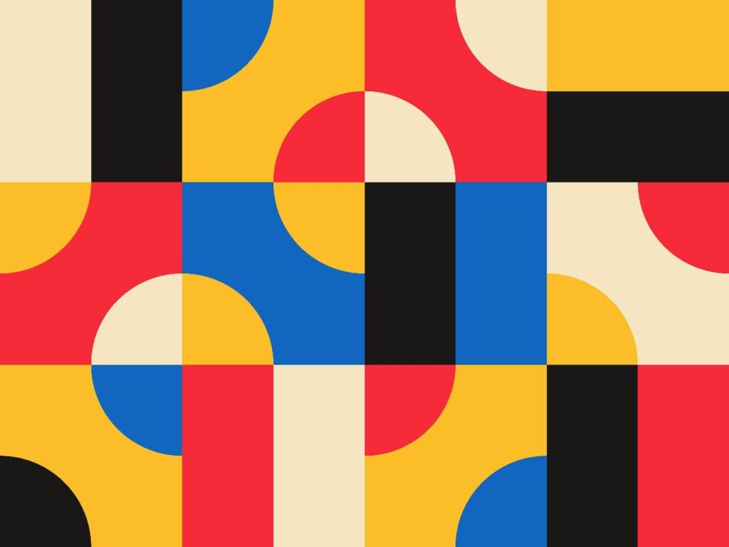
For this, you can practice with your pencil and sketchbook and do quick drawings by hand. Then, you can save time by doing a sketch instead of a digital picture.
Furthermore, it will help to look for bold lines and poses or movements for an image. So, when doing a sketch, you should understand it, take the time needed, and then experiment and be creative.
4. Apply different angles
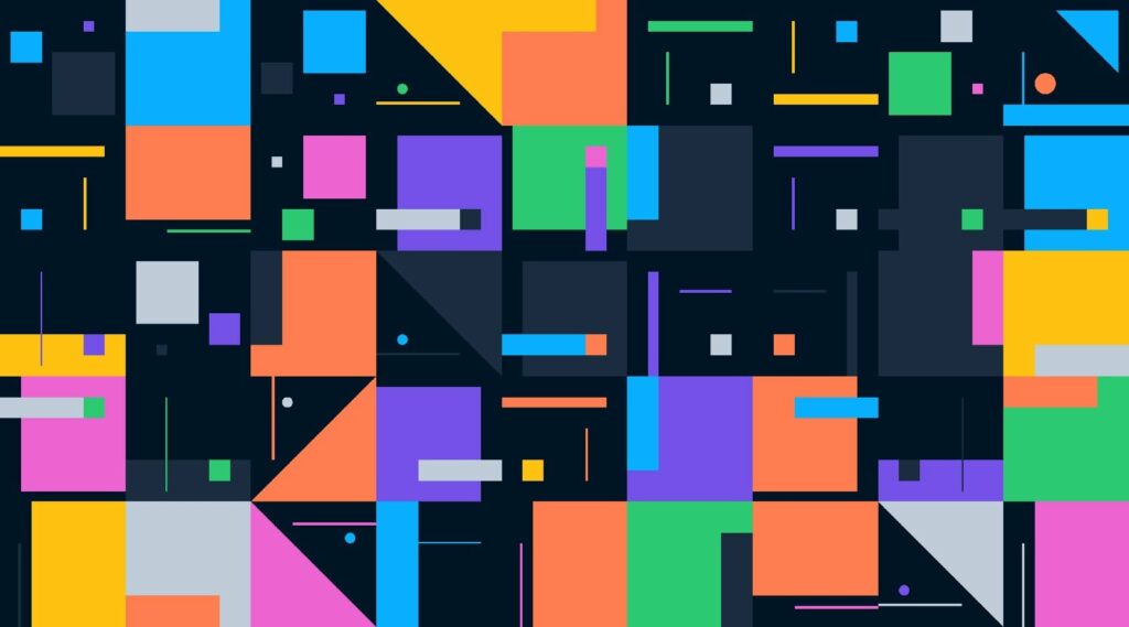
It’s best to use your imagination to see how your artwork would appear from various angles once you have decided on the structure.
So, consider how it may be viewed from a convergence point, 3-year-old perspective, fisheye lens, and a tall athlete. Using these tips, you can better understand which angle will be advantageous for your picture’s objective.
5. Strengthen your idea through the use of colors
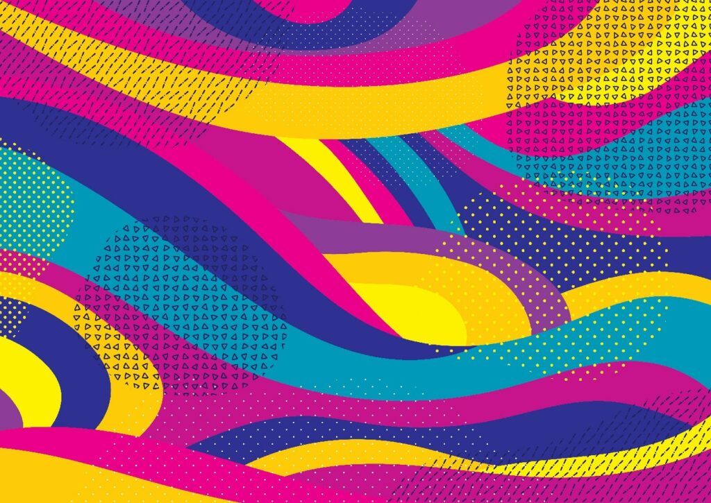
You should also select the colors carefully to help strengthen the message of your illustration. After all, the colors will set the correct accent and mood of your illustration’s most critical aspects.
Aside from this, the tone contrast should be balanced; this can be done by checking the appropriateness of the selected tones by viewing your work in a black and white setting.
6. Apply textures

In general, textures can create vividness to your illustration and contribute to its uniqueness and overall effect. Aside from this, it can make the vector image softer. With that said, textures may mimic the following:
- Geometrical details (such as stripes and dots)
- Realistic details and materials (like scuff marks)
- Hand-made details with uneven lines.
Furthermore, you can also use full and colored patterns to make an incredible effect. The mentioned variants can be utilized in combination or separately. So, by following this trick, you can develop your personal skills when creating flat design illustrations.
Final Words
Overall, flat illustrations will continue to develop for the next few years, along with the various artistic designs. Nevertheless, nowadays, flat designs have paved the way for the creative world because of their simplicity, flexibility, and artistic approach.
Therefore, if you have not tried flat design before, now is the right time to learn and practice how to illustrate flat design with the help of the tips mentioned above.


